Using dobin for time series data
Published:
This is a blogpost I did in Nov 2019 on dobin - a method used for dimension reduction for anomaly detection.
The R package dobin can be used as a dimension reduction tool for anomaly detection. So, if we have a dataset of $N$ independent observations, where each observation is of dimension $p$, dobin can be used to find a new basis, such that the anomalies of this dataset are highlighted using fewer basis vectors (see here).
But, how do we use dobin for time series data? Dobin is not meant for raw time series data because it is time-dependent. But we can break a time series into consecutive non-overlapping windows and compute features of data in each window using an R package such as tsfeatures. If we compute $d$ features, then data in each time series window will be denoted by a point in $\mathbb{R}^d$.
A Synthetic Example
Let’s look at an example. We make a normally distributed time series of length $6000$ and insert an anomaly at the position $1010$.
knitr::opts_chunk$set(
  fig.path = "../assets/images/posts/dobin_time_series/",  # Where to save files
  fig.cap = " ",
  fig.align = 'center'
)

# # Override the path that appears in markdown
# hook_plot = knit_hooks$get('plot')
# knit_hooks$set(plot = function(x, options) {
#   x = gsub("../assets", "/assets", x)
#   hook_plot(x, options)
# })

library(tsfeatures)
library(dplyr)
library(dobin)
library(ggplot2)
set.seed(1)
# Generate 6000 random normally distributed points for a time series
y <- rnorm(6000)
# Insert an additive anomaly at position 1010
y[1010] <- 6
df <- cbind.data.frame(1:6000, y)
colnames(df) <- c("Index", "Value")
ggplot(df, aes(Index, Value)) + geom_point() + theme_bw()
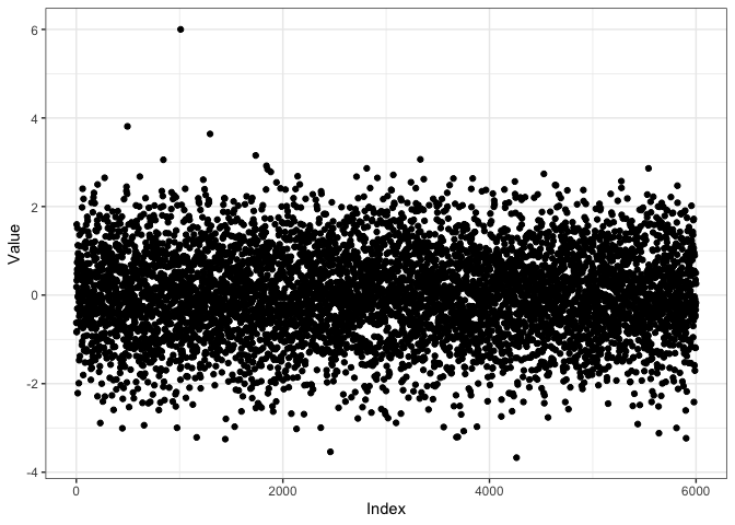
Now, let us break the time series into non-overlapping chunks of length $50$, i.e. we get $120$ chunks or windows. Why do we use non-overlapping windows? If we use overlapping windows, say sliding by $1$, the outlying point in the time series contributes to $50$ windows. Later, when we compute features of these time series windows, these $50$ windows will have similar features, but they will not be anomalies in the feature space, because there are $50$ of them. That is why we use non-overlapping windows.
Also, note that we need the time series to have a decent length to compute features. For each window we compute time series features using tsfeatures.
# Split the time series into windows of length 50
my_data_list <- split(y, rep(1:120, each = 50))
# Compute features of each chunk using tsfeatues
ftrs <- tsfeatures(my_data_list)
head(ftrs)
## # A tibble: 6 × 16
##   frequency nperiods seasonal_period  trend   spike linearity curvature   e_acf1
##       <dbl>    <dbl>           <dbl>  <dbl>   <dbl>     <dbl>     <dbl>    <dbl>
## 1         1        0               1 0.0506 1.01e-3     0.354    0.212  -0.00211
## 2         1        0               1 0.110  6.68e-4    -0.500    0.0679 -0.147
## 3         1        0               1 0.201  8.10e-4    -2.18    -0.836  -0.341
## 4         1        0               1 0.129  5.11e-4    -0.402   -1.57   -0.209
## 5         1        0               1 0.134  7.74e-4    -0.817    1.39   -0.165
## 6         1        0               1 0.0673 1.06e-3     0.130    0.681  -0.318
## # ℹ 8 more variables: e_acf10 <dbl>, entropy <dbl>, x_acf1 <dbl>,
## #   x_acf10 <dbl>, diff1_acf1 <dbl>, diff1_acf10 <dbl>, diff2_acf1 <dbl>,
## #   diff2_acf10 <dbl>
It is easier to find a good set of basis vectors that highlight anomalies when there are a lot more points compared to the dimensions of the dataset, i.e. $N > p$. In this case the feature space is $16$ dimensional, and we have $120$ points, each point corresponding to a window of the time seires.
Next we input these time series features to dobin.
ftrs %>% dobin(norm=2) -> out
coords <- as.data.frame(out$coords[ ,1:2])
colnames(coords) <- c("DC1", "DC2")
ggplot(coords, aes(DC1, DC2)) + geom_point() + theme_bw()
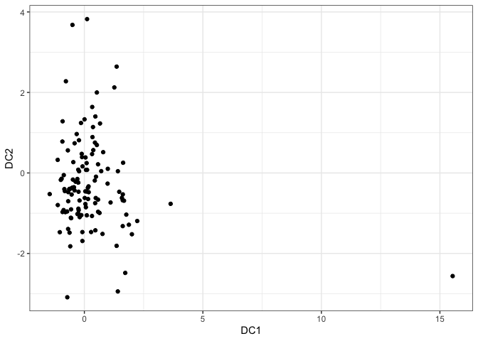
In the first and second dobin component space (DC1-DC2 space), we see a point appearing far away near $(15, -5)$. Let’s investigate this point.
inds <- which(coords[ ,1] > 10)
inds
## [1] 21
OK, this point is coming from window 21. Also, this point deviates in the DC1 axis. So, let us look at the first dobin vector.
# First dobin vector
out$vec[ ,1]
## NULL
colnames(ftrs)
##  [1] "frequency"       "nperiods"        "seasonal_period" "trend"
##  [5] "spike"           "linearity"       "curvature"       "e_acf1"
##  [9] "e_acf10"         "entropy"         "x_acf1"          "x_acf10"
## [13] "diff1_acf1"      "diff1_acf10"     "diff2_acf1"      "diff2_acf10"
The first vector has a high value in spike (), which measures the amount of spikiness in a time series. Now, let’s have a look at the 21st window of the time series.
# Make a dataframe from window 21
df2 <- cbind.data.frame((1000 + 1:50), my_data_list[[inds]])
colnames(df2) <- c("Index", "Value")
ggplot(df2, aes(Index, Value)) + geom_point() + geom_line() + theme_bw()
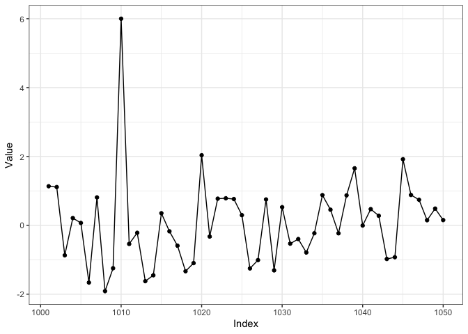
We see that we’ve picked up the spike corresponding to position $1010$, in the 21st window, because $1010/50 = 20.2$.
A Real Example
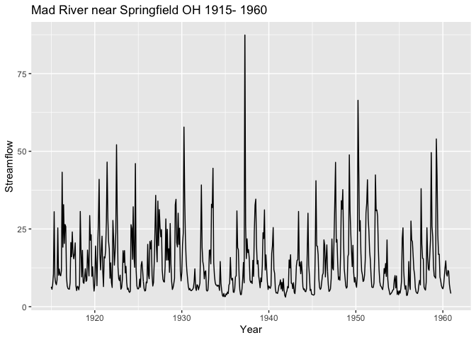
Next we look at a real world example containing the streamflow from Mad River near Springfield, Ohio from 1915- 1960.
library(fpp)
library(ggplot2)
library(tsfeatures)
library(dobin)
library(tsdl)

tt <- tsdl[[77]]
autoplot(tt) +  ggtitle("Mad River near Springfield OH 1915- 1960") +
  xlab("Year") +  ylab("Streamflow")
Let’s split the time series into non-overlapping windows and compute features as before.
my_data_list <- split(tt, rep(1:23, each = 24))
# Compute features of each chunk using tsfeatues
ftrs <- tsfeatures(my_data_list)

ftrs[ ,4:7] %>% dobin() -> out

coords <- as.data.frame(out$coords[ ,1:2])
colnames(coords) <- c("DC1", "DC2")
ggplot(coords, aes(DC1, DC2)) + geom_point(size=2) + theme_bw()
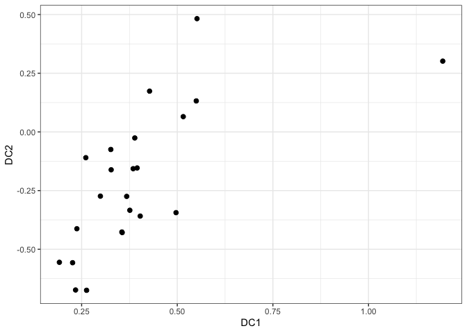
We see a point having a DC1 value greater than 1. Let us investigate that point.
ind <- which(coords[ ,1] > 1)
ind
## [1] 12
df <- cbind.data.frame((11*24+1):(12*24), my_data_list[[ind]])
colnames(df) <- c("Index", "Streamflow")
ggplot(df, aes(Index, Streamflow)) + geom_point() + geom_line()
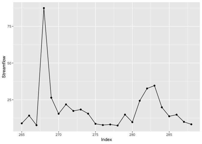
We see this point corresponds to the window with the highest spike in the time series, as this is the only spike greater than 75 units.
So, in summary dobin can be used as a dimension reduction technique for anomaly detection for time series data, as long as the data is prepared appropriately.
